
This post examines a recent Medscape survey comparing physicians in the US to physicians around the world in terms of compensation and other metrics.
The report itself is presented as slides (like a Buzzfeed “top 10” list you have to click through) with some commentary beneath each slide.
Please note: this post will lack my characteristic GIFs due to the excessive number of images of slides from the report. I understand if this leaves a gaping hole in your soul. Just remember, it’s only for this week and the GIFs will return next week!
Also note: all images (except the blog title and the first image that I created) come from the linked Medscape report.
Please note that the link above is to a Google search for the article as linking directly to it requires a Medscape login. It is currently the first hit. If it still prompts for a login, know that it is free to join if you choose.
Surveys Strikes Again!
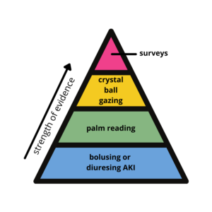
In my last examination of a Medscape survey, I jested that surveys are the paragon of evidence on which we rely. I made a nifty diagram in that post that I thought I’d update here with new levels. You’re welcome.
From Whence the Data Came
Now that we’re gotten that out of the way, let’s take a look at this survey, shall we?
This was a 10-minute online survey that garnered almost 20,750 respondents from eight countries:
- United States
- United Kingdom
- France
- Germany
- Spain
- Italy
- Mexico
- Brazil
However, over 64% of respondents were from the US. Compared to each of the other nations, the US had 10-18x the representation in this survey!
Surprisingly, (or perhaps unsurprisingly) there’s no representation from eastern Europe, Africa, the Middle East, Oceania (that’s just fun to say), and all of Asia. I mean, c’mon!
Running some basic numbers that includes Googling the number of physicians in these countries reveals the physician response rate to be:
- US = 1.33%
- UK = 0.50%
- Germany = 0.14%
- Brazil = 0.32%
Not super impressive numbers by any stretch of the imagination. But getting data from doctors is challenging, so we will take what we can get!
Note: all currencies were converted to USD.
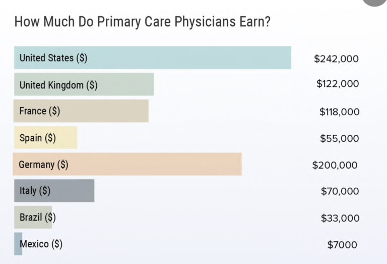
How Much Do Physicians Earn?
No surprise to anyone reading this, US physicians earn the most, averaging $316,000.

Our average salary is a multiple of the other nations’ average salary save Germany. This is a reflection of the differences both in our healthcare systems and in the value we place on physician compensation.
The report does break the salary down as primary care versus specialty, and then further delineates specialist’s pay by gender. I’m not sure what all specialties they include in primary care—e.g, do they count OB/GYN as primary care?
What is the color system here?! Why switch some countries colors!?
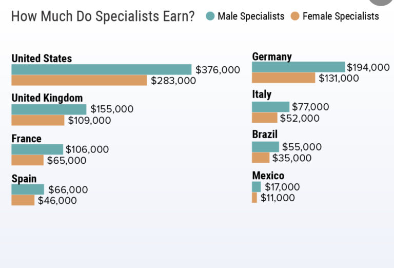
In general, specialists outearn their primary care counterparts, except in France and Germany. I don’t know enough about the difference in training in these parts of the world to speak to the reasons why, but it’s interesting to note.
If these numbers surprise you and you’re thinking (as a US physician) that you don’t make anywhere near these amounts, then it’s important to note that intra-specialty pay differences are greater than inter-specialty pay differences. The White Coat Investor has reviewed this phenomenon of pay variation within specialties here and here.
I’m not sure why there isn’t an average for specialty pay compared to primary care pay as this would help determine where earnings between the two are most similar and most divergent.
Aha! I found that data in a different Medscape survey: specialists earn on average $344,000 compared to primary care’s $242,000. This can be found in this Medscape survey.
The Gender Pay Gap

I suspect they had more specialist respondents to allow them to examine the pay difference between men and women. This begs the question of why this might have been the case.
The ratio of primary care to specialists in the US is 1:4. Globally, this ratio is generally reversed. I cannot tell how this may have impacted the data … suffice it to say, it likely impacted the data!
While the absolute dollar amount in gender pay disparity is greatest in the US, the percentage difference is actually the lowest; in the US, male specialists earn 22% more than women.
Mexico had the worst gender pay disparity where men earn 75% more than women. France and Brazil also had disparities where men earn > 1.5x what women earn.
Is it Fair?
The next slide looks at whether or not physicians think their compensation is fair.
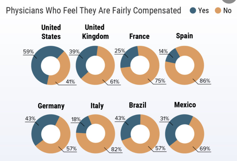
Almost 60% of US physicians felt they were compensated fairly. Most likely to feel this way were oncologists, psychiatrists, plastic surgeons, and dermatologists. Disappointingly, there is no breakdown here between gender.
Physician satisfaction with compensation was lowest in Italy, France, and Spain.
The next slide shows the comparison of physician net worth.
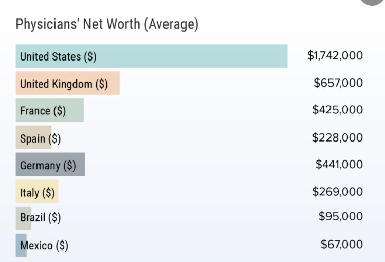
The survey results show that the US figure of $1.7 million is a multiple of the net worths in the other nations. Net worth is the sum of all assets minus all debts.
The US figure suggests to me that the respondents skewed towards specialists (perhaps appropriately given the ratio I referenced above) and/or older, wealthier physicians.
Next we look at the debts burdening physicians.
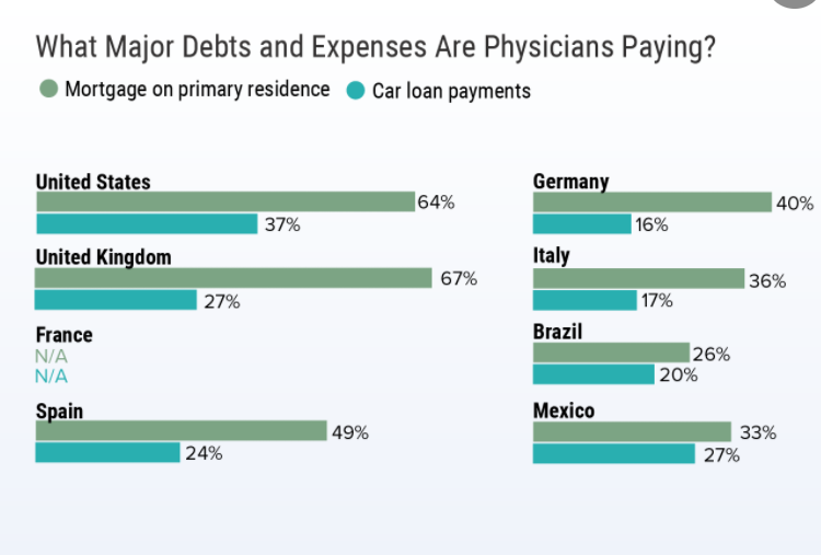
For some reason, they only looked at mortgages and car payments, even if these were not the leading debt burdens in other countries. For example, the commentary states that in Mexico, credit card debt accounted for 52% of all debt. Similarly, in Brazil, child care ranked highest at 35%.
Despite an average student loan burden of $200,000+ upon med school graduation in the US, student loans are mysteriously absent here. This may make sense if the US respondents were older/further along in their careers and/or if this was not a major source of debt in the other countries, and thus didn’t make the cut as a choice. I still find it odd.
How COVID Impacted Pay

In 2020, 25-40% of physicians saw their income drop. US physicians were most impacted by this.
I would attribute this to our fee-for-service system and the fact that so many doctors had to shut down operations for several months or saw clinical volumes dwindle, which the next slide confirms.
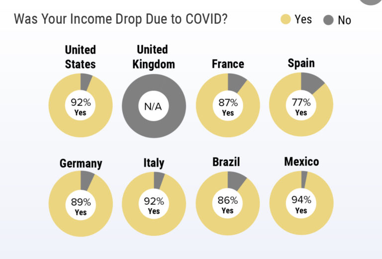
COVID was the income-dropping elephant in the room globally. Again, it would have been illuminating to see this broken down by gender as I imagine the bulk of child care and distance learning duties disproportionately fell to women physicians. Thus, they would have cut back time or left their jobs entirely more so than men. I don’t have any data to specifically back that up—I’m just extrapolating from non-pandemic data and observations.
Doctoring in the Time of COVID
This survey also queried respondents on how their workdays had changed during the pandemic.
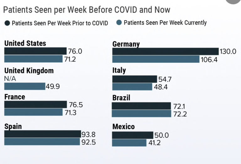
First, patient volumes are overall down compared to pre-COVID levels except in Brazil and Spain where they have remained stable.
Personally, I feel my patient numbers are back up to pre-COVID levels. However, this survey ran from October 2020 to March 2021 and my numbers were still down then too in clinic (despite having a tremendous amount of work to do!). Patient numbers do not tell the entire picture of how we spend our time working, even if that’s all our compensation is tied to for many of us.
I wonder if hospital-based physicians were less likely to fill out this survey since inpatient volumes have been higher?
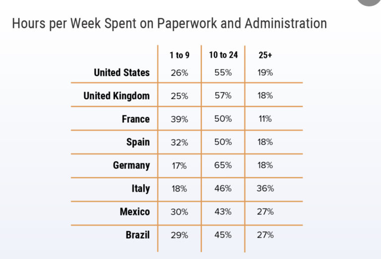
I’ll quote the commentary to sum this slide: “Physicians everywhere voiced complaints about the nightmare of too much unending paperwork.”
Amen. This is why I have made charting the focus of my coaching!
By visual estimation, physicians in Italy spent the most time charting while those in France spent the least. American physicians were in the middle of the pack.

Similar to the graphic on sources of debt, the above graphic strikes me as odd in the two categories presented. Why those two? I get the long hours one, but not the “so many rules and regulations” one.
Don’t get me wrong—there’re plenty of rules and regulations, but I’m not sure that’s the most challenging aspect, especially based on other Medscape surveys.
Maybe the question was worded a certain way or maybe the answer choices (if this was a multiple choice question) drove respondents to this answer? A poorly worded question leads to poor quality answers. (To be fair, this is a survey).
Moving on, Medscape lastly asked about use of telemedicine, which rose to prominence thanks to the pandemic and (here in the US) CMS’ easing of certain restrictions.
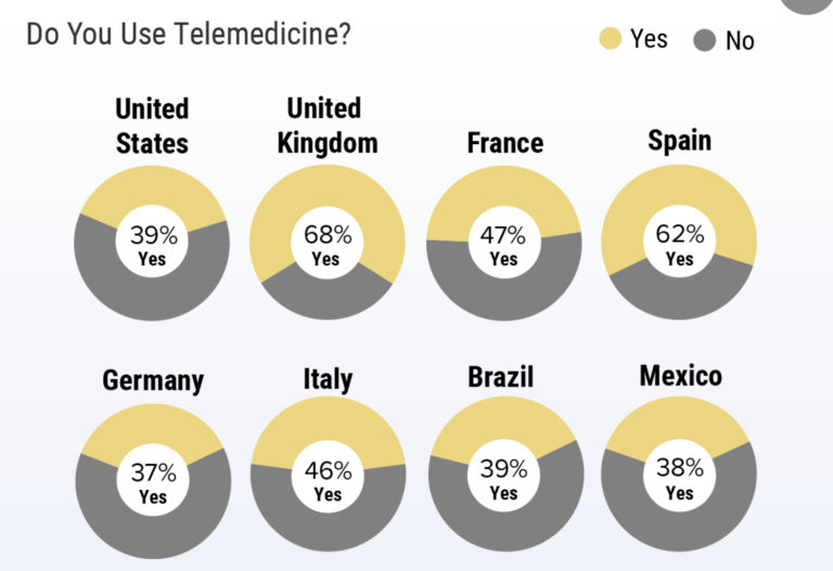
In the US, almost 40% of physicians use telehealth in some form to care for patients. We are in the back half of the nations surveyed. Sixty-eight percent of UK physicians offered virtual care, which is impressive.
I’m a big fan of telehealth as it allowed me to care for much of my patient panel when my clinic closed down for a few months. I try to use it strategically now with good success; it affords both my patients and me some much needed flexibility previously unavailable in medicine.
Overall Impression
This survey was all over the place. Frankly, it’s the worst Medscape survey I’ve seen (we’re talking like an n of 8 here). That being said, collecting data in physicians in the US is challenging, so trying to do so at a global level is nigh impossible. I still find the lack of a more representative sample of nations the most significant limitation.
It’s clear that US physicians earn more—usually considerably more—than our international counterparts. But critical differences in our health care systems, medical education (and cost of), and even culture (e.g., rescue medicine in the US) are not captured or conveyed here and make more than superficial comparisons folly.
Glean from this survey what useful information you can, and leave the rest. If you were one of the respondents (slim chance, I know), I’d love to hear what you thought about taking it!
Medicine is tough no matter where you practice. Despite the challenges of practicing in the US especially when we’re a global COVID hotspot, I still enjoy medicine and am grateful to have the opportunity to do so!
Do you have a different take on the results from this survey? Let me know in the comments section below.
If you haven’t subscribed to my email list, then do so below so you don’t miss my new posts or my weekly updates (only for subscribers).
I’d also be most appreciative if you shared this post with anyone whom you think would benefit from the content or message of the blog.